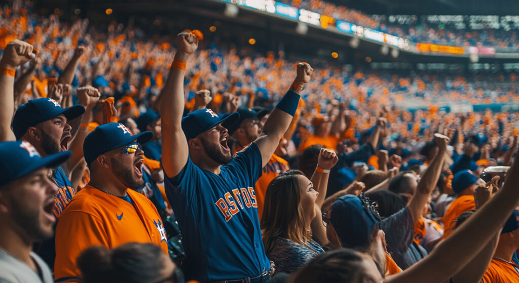
FOR THE FIRST TIME IN FRANCHISE HISTORY, THE #ASTROS ARE #WORLDSERIES CHAMPIONS! #EARNEDHISTORY https://t.co/lTo9MNqzVR
— Houston Astros (@astros) November 2, 2017
Houston Astros Logos Through The Years
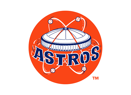
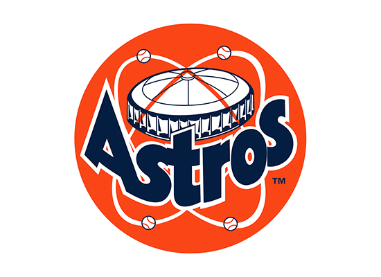
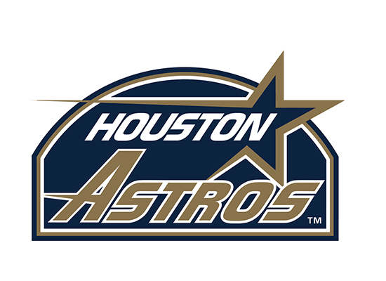
Logo Inspiration
All the excitement of the Houston Astros playing in the World Series got me inspired to design a concept to see if I could come up with a different idea or design utilizing my creative talent. I did look around to see if there were other logo designs for the Astros, but didn’t really find anything, so I decided to go ahead and give it a try.
I have to tell you that I wasn’t a huge baseball fan. I started getting more into baseball about a year ago after my son started playing the game and being around the kids every single game they played. I wanted him to experience what it was like to be in a real professional game and see all of the players play the game. So I took him to an Astros game one day and he really seemed to enjoy looking at what it’s like to be there. After being involved in his baseball team for a couple of seasons and helping out the coaches I realized that I was beginning to really like baseball. It was much more enjoyable now that my kid was playing it.
I was thinking about the Astros logo icon as I was watching the World Series and got a thought in my head about a different way the logo or icon could be designed. I was thinking of incorporating the “H” in Houston and the “A” in Astros both in the same icon. Most people would have no clue about gathering an idea, let alone, design an iconic design that would incorporate these two letters. After lots of thinking about different concept ideas in my head, an idea came to me that I had to put on paper right away.
Houston Astros New Logo Concept
Now that we’ve looked at the Houston Astro’s history and what their current and past logos have looked like we’ll get to the main part of this blog post. The New Astros Logo Concept that I came up with while watching the 2017 World Series. The logo icon concept below can be found on my Instagram feed. Don’t forget to follow me!

Houston Astros Baseball Cap Concept
I also designed a Houston Astros baseball cap concept that I think came out pretty good. It has a color scheme that incorporates an orange and blue color palette. Take a look below and tell me what you think in the comments at the bottom of the page.
