Jaguar’s New Logo: A Bold Leap Into Modernity or a Departure from Tradition?
In the ever-evolving landscape of automotive branding, few names carry the same weight as Jaguar. Synonymous with elegance, power, and precision, the luxury car manufacturer has long stood out with its iconic leaping cat logo. In November 2024, however, Jaguar unveiled a new brand identity, marking a significant transformation for the automaker. The redesigned logo aims to represent the brand’s future-forward vision as it transitions into an all-electric luxury automaker. While the rebranding is undeniably bold, it raises the question: does this modernized logo enhance Jaguar’s identity, or does it stray too far from the timeless elegance of its predecessor?
Jaguar's New Logo: A Modern Approach
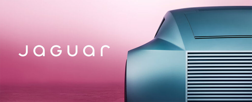
Jaguar’s new logo, revealed as part of the company’s “Reimagine” strategy, is a departure from the classic, motion-filled leaping cat emblem that has been a hallmark of the brand for decades. Instead, the redesign features a minimalist geometric typeface, blending uppercase and lowercase characters to form a clean, sleek wordmark. According to Jaguar, this fresh design embodies the concept of “Exuberant Modernism,” a philosophy rooted in fearlessness, artistry, and originality.
The company’s rationale for the update is tied to its strategic pivot toward becoming an all-electric luxury brand. This includes a lineup of electric vehicle (EV) models that will begin rolling out in 2025. Jaguar’s commitment to modernity and innovation is also reflected in its branding, which the automaker hopes will resonate with a new generation of environmentally conscious luxury car buyers.
Why the Change?
Rebranding is often a risky but necessary move for companies looking to adapt to market changes and cultural shifts. For Jaguar, the decision to modernize its logo was likely driven by several factors:
-
The Shift to Electric Vehicles (EVs):
As the automotive industry increasingly prioritizes sustainability, Jaguar is positioning itself as a leader in the luxury EV market. The new logo is intended to symbolize this forward-thinking vision. -
Appealing to Younger Audiences:
Jaguar’s traditional branding resonates deeply with its established customer base, but the new minimalist aesthetic is aimed at attracting younger, design-conscious consumers. -
Global Market Trends in Branding:
Across industries, there is a noticeable trend toward simpler, more versatile logos. Jaguar’s updated design aligns with this movement, ensuring it translates seamlessly across digital platforms, merchandise, and EV displays.
The Classic Jaguar Logo: A Symbol of Elegance
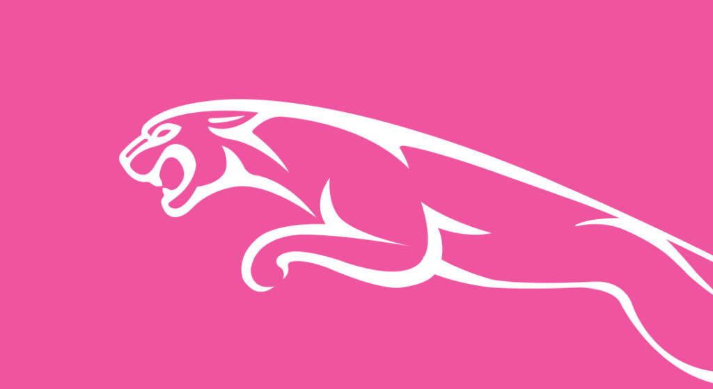
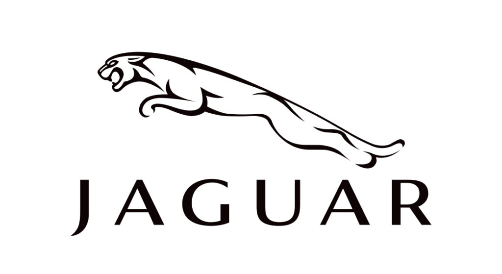
For decades, Jaguar’s leaping cat logo was more than just a design—it was a statement. The sleek, dynamic feline embodied the brand’s core qualities: grace, agility, and power. The emblem conveyed a sense of motion and energy, perfectly aligning with the performance and luxury associated with Jaguar vehicles.
From a design perspective, the original logo was a masterclass in visual storytelling. Its flowing lines and poised stance immediately communicated the brand’s identity, making it one of the most recognizable symbols in the automotive world. Moreover, the logo wasn’t just a graphic; it was a promise—a representation of the driving experience Jaguar offered.
How Does the New Logo Compare?
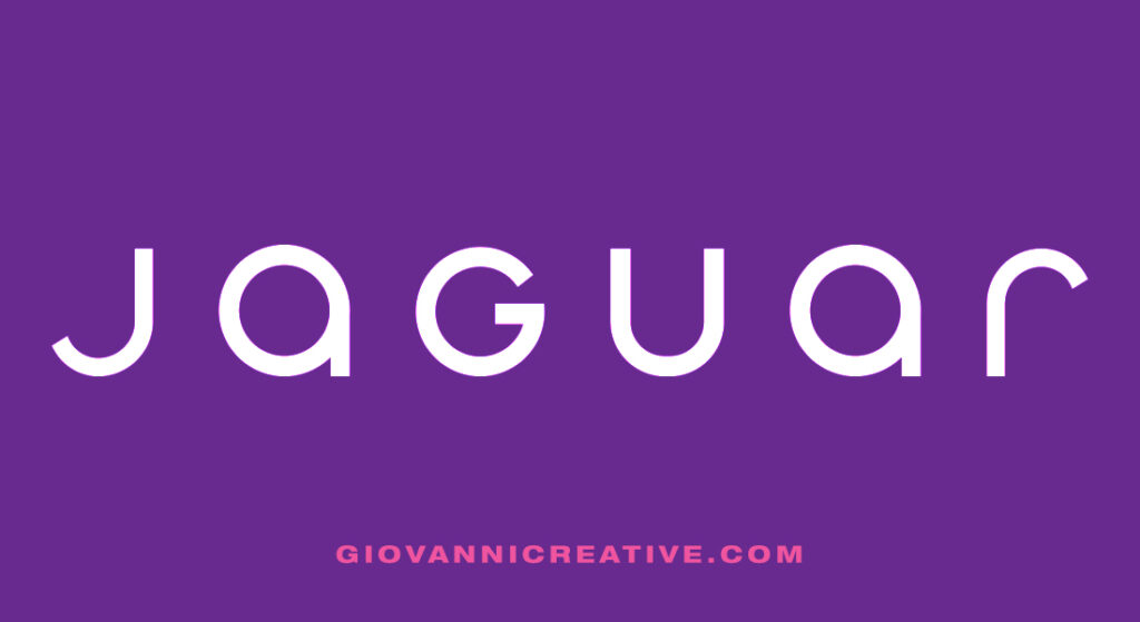
The updated logo, while modern and minimal, has drawn mixed reactions. Here’s a closer look at its pros and cons:
Strengths of the New Logo:
-
Simplicity and Versatility:
The clean design makes the logo easy to adapt across various platforms, from digital media to vehicle interiors. -
Alignment with Trends:
Minimalist logos are on the rise, and Jaguar’s redesign ensures the brand remains contemporary and appealing to younger audiences. -
Future-Focused:
The logo reflects Jaguar’s evolution as a forward-thinking, electric-first automaker.
Challenges with the New Logo:
-
Loss of Iconic Symbolism:
The leaping cat carried an emotional resonance that the geometric wordmark struggles to replicate. -
Reduced Character:
While modern, the new logo risks feeling generic compared to the distinctive identity of the classic design. -
Disconnect with Heritage:
Jaguar has a rich history, and the new logo may feel like a departure from the brand’s roots for long-time enthusiasts.
My Perspective: The Timelessness of the Leaping Cat
As a creative professional with a deep appreciation for design and branding, I believe the original leaping cat logo better represents Jaguar’s heritage and identity. It wasn’t just a logo—it was a symbol of the brand’s commitment to excellence, elegance, and innovation. The dynamic pose of the cat communicated motion, speed, and grace in a way that resonated with Jaguar’s vehicles and ethos.
The new logo, while sleek and undeniably modern, feels more neutral and less emotionally engaging. It aligns well with digital trends and the clean aesthetic popular among tech-forward companies, but it lacks the storytelling depth of the classic emblem. For a brand like Jaguar, with decades of history and a reputation for luxury, maintaining a connection to its legacy is just as important as embracing the future.
Balancing Tradition and Innovation
The challenge for brands like Jaguar lies in striking a balance between honoring tradition and embracing innovation. Rebranding is not inherently bad—it’s often essential to stay relevant in a changing market. However, the key is to evolve in a way that retains the essence of what made the brand iconic in the first place.
Jaguar’s new logo may succeed in positioning the company as a modern, forward-thinking automaker, but it risks alienating loyal customers who feel a deep connection to the leaping cat. The ideal approach might have been to evolve the classic logo rather than replace it entirely, blending the brand’s legacy with its future aspirations.
Industry Reactions and Public Perception
As with any major rebranding effort, the reception to Jaguar’s new logo has been mixed:
-
Supporters appreciate the sleek, contemporary design and its alignment with Jaguar’s vision for an electric future. They see the rebranding as a necessary step to keep the company relevant in a competitive market.
-
Critics, on the other hand, feel that the new logo lacks the emotional depth and distinctive character of the classic leaping cat. For many, the original emblem was synonymous with Jaguar’s heritage and performance-driven ethos.
The ultimate test will be how the new logo resonates with both current customers and new audiences in the years to come.
Looking Ahead: The Future of Jaguar’s Branding
As Jaguar embarks on its journey as an all-electric luxury brand, the success of its rebranding efforts will depend on more than just its logo. Consistency across all touchpoints—vehicles, marketing materials, and customer experiences—will be essential in reinforcing the brand’s identity.
While the new logo signifies a bold leap into the future, there is room for reflection on how Jaguar can maintain a connection to its storied past. The leaping cat remains a powerful symbol, and integrating elements of that legacy into the brand’s evolving narrative could help strike the perfect balance between innovation and tradition.
Final Thoughts
Jaguar’s new logo represents a significant shift in the brand’s identity, one that reflects its ambition to lead in the luxury EV market. While the modern design aligns with current trends and future aspirations, the classic leaping cat remains an irreplaceable icon of Jaguar’s elegance and performance heritage.
As a creative professional, I admire the boldness of Jaguar’s rebranding effort. However, I believe the original logo better encapsulates the brand’s essence. It’s a reminder that great branding isn’t just about looking forward—it’s about carrying the best of the past into the future.
What are your thoughts on Jaguar’s new logo? Does it capture the brand’s vision, or do you prefer the timeless elegance of the leaping cat? Let’s discuss!
